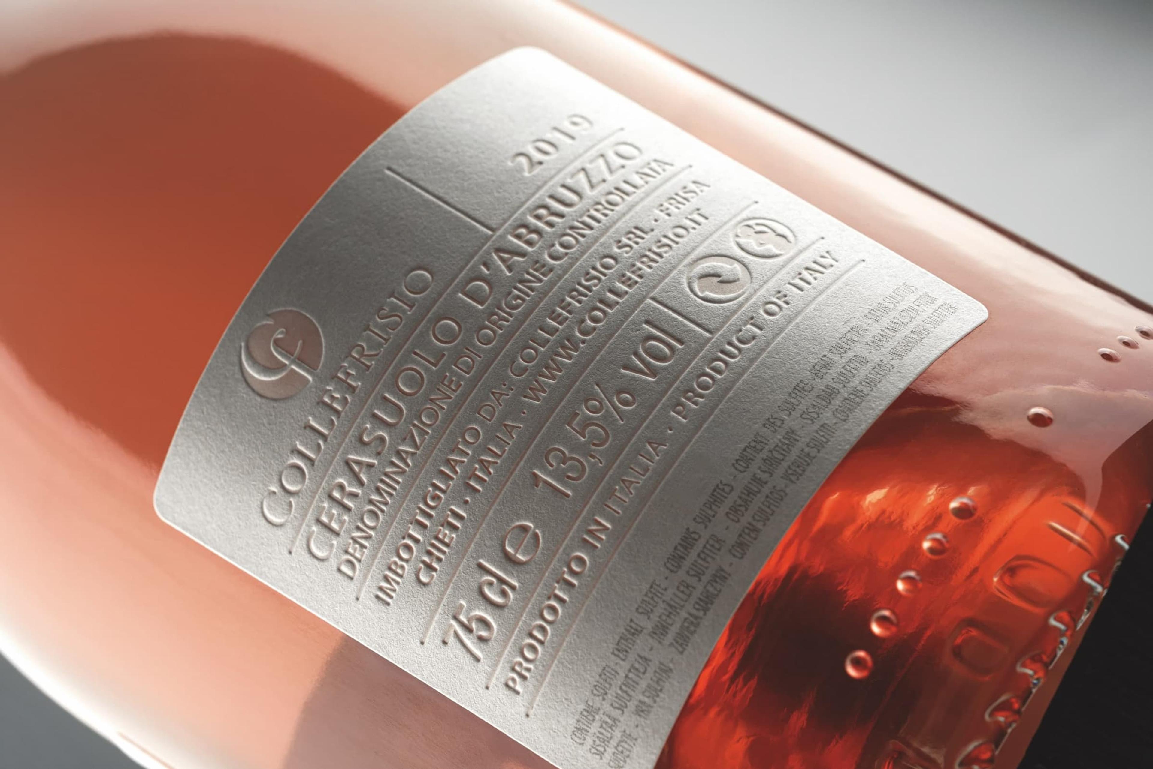
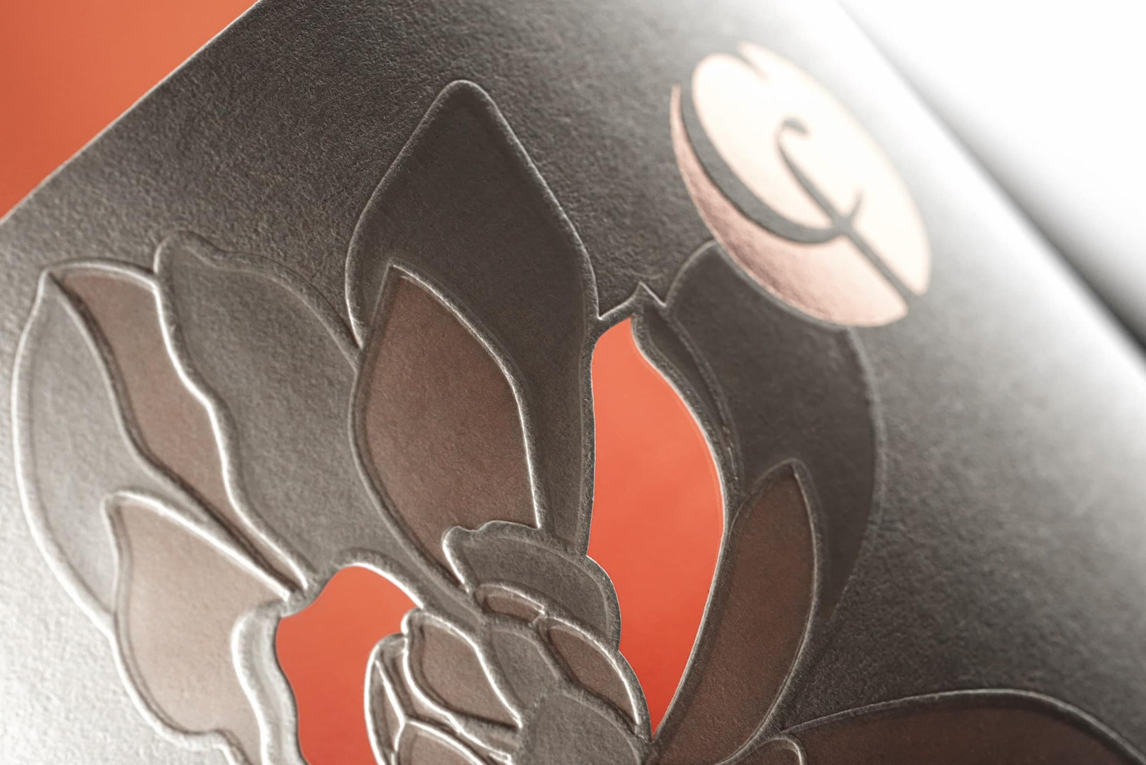
Collefrisio / Magnolia
In the language of flowers, the magnolia represents purity and modesty. This is precisely why we chose it to represent a rosé from the Collefrisio winery.
Collefrisio / Magnolia
In the language of flowers, the magnolia represents purity and modesty. This is precisely why we chose it to represent a rosé from the Collefrisio winery.
The idea of purity and modesty of wine come to life in a label that is slowly revealed through the interplay of the reliefs and reflections of the natural heat-sensitive paper. The white colour and the shapes of the petals are revealed by the light, accentuating the three-dimensional perception of the flower.
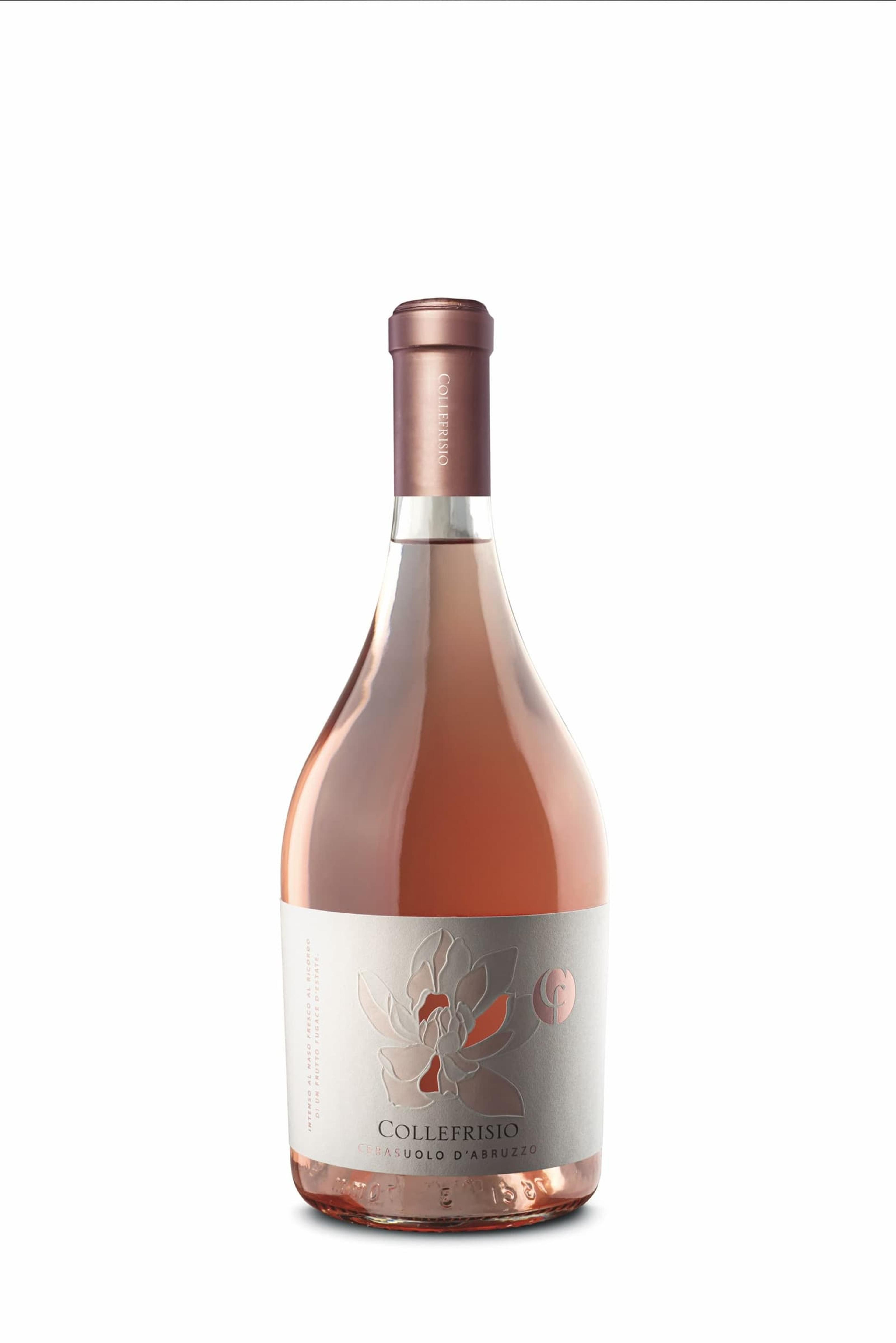
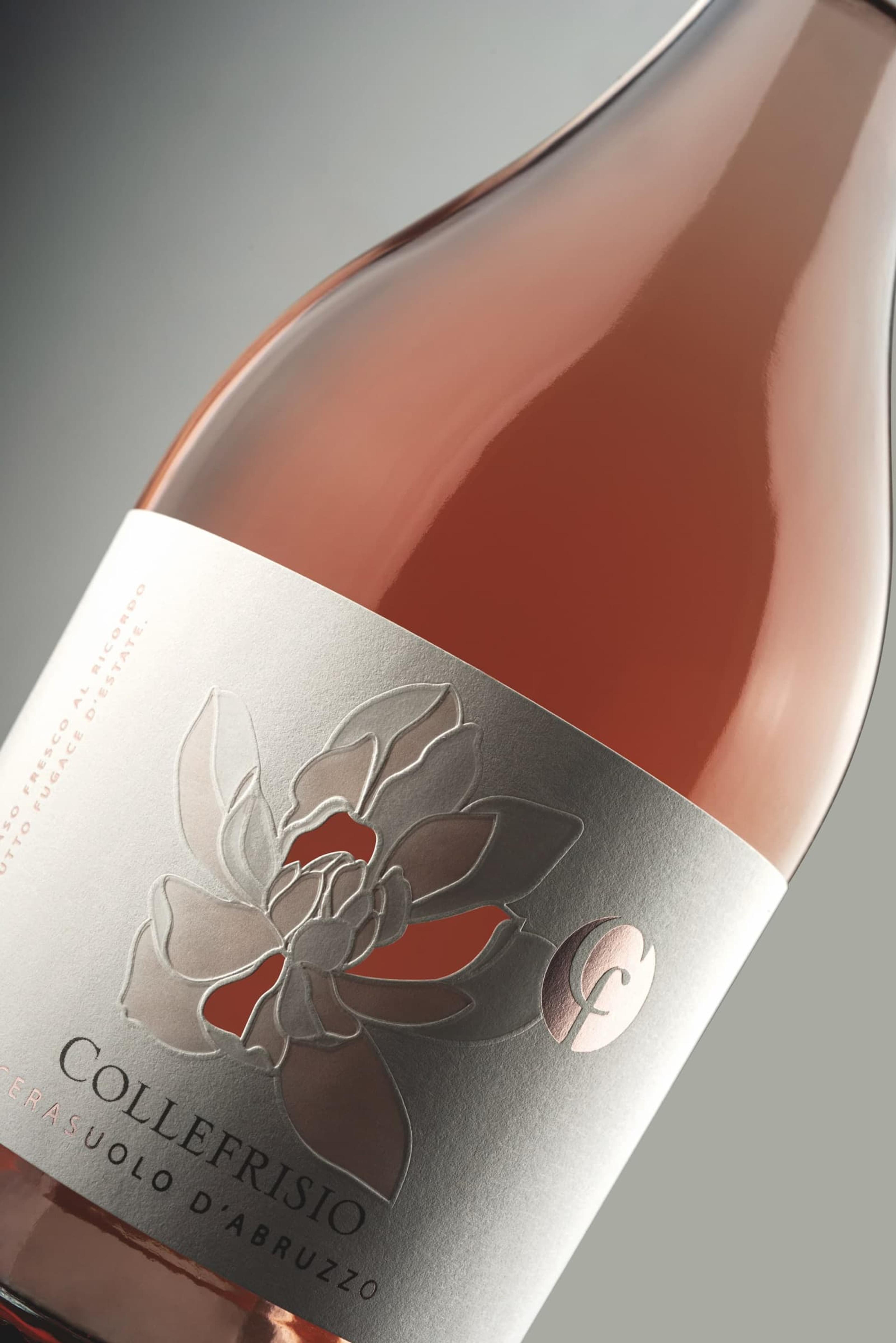
We worked with different printing techniques: using transparency, by the thinning of the paper, some petals bear the wine’s pink colour; using reflection, others shine due to polishing; using shading, embossings make the borders of the design vibrate and define.
Finally, for depth, with the diecut shapes revealing the liquid in the bottle. To fully coordinate the packaging, we then made the back label using the same thermal crushing technique.